The Leafs are changing their logo

Collapse
X
 
  • Filter
  • Time
  • Show
Clear All
new posts
  • BillsSabresB.C.T. Fan
    All-Pro Zoner
    • Jan 2004
    • 4556

    The Leafs are changing their logo

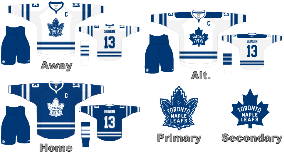
    When Toronto's new jersey is unveiled next month at the NHL All-Star Game in Dallas, expect to see something that looks essentially the same as the current version, save for one important detail: the maple leaf logo.

    The hallowed maple leaf has apparently been altered, having a "different silhouette," according to a team executive.

    The change represents a "modernization" of the logo rather than a dramatic redesign.


    It looks like Larry Quinn was right on everthing he's said about ours. It looks like RBK are going to change the logos for all the teams. Just answer me one thing if we're protesting our new logo what do you think Toronto will do? I mean they've had this since the 1920's you talk about tradition.
    Last edited by BillsSabresB.C.T. Fan; 12-03-2006, 03:49 AM.
  • Valerie
    Saving the World One Signature at a Time!
    • Jul 2002
    • 22477

    #2
    Re: The Leafs are changing their logo

    I was hoping to see what the new jersey looks like. And honestly, after seeing all the red Sabres jerseys on Saturday night, I really don't know what Buffalo was thinking with the yellow and blue. I really don't like the new jerseys at all. I hope the Leafs jerseys don't change too much. I like the ones they have now.


    There's not a stone in my heart I've left unturned
    Not a piece of my soul that I ain't searched
    The only answer I found for all this hurt
    Is there ain't not answer here on earth

    Comment

    • Philagape
      WIN NOW
      • Jul 2002
      • 19432

      #3
      Re: The Leafs are changing their logo

      If it's anything like ours, it'll be a yellow leaf with no pointy ends
      "It is better to be divided by truth than to be united by error." -- Martin Luther

      "Those who appease the crocodile will simply be eaten last." -- Winston Churchill

      2003 BZ Pick Em Champion
      2004 BZ Big Money League Champion

      Comment

      • hammerbillsfan
        Registered User
        • Aug 2005
        • 17878

        #4
        Re: The Leafs are changing their logo

        oh god no

        Comment

        • Bufftp
          Hi Dave!

          Administrator Emeritus
          • Jul 2002
          • 18062

          #5
          Re: The Leafs are changing their logo

          Originally posted by Valerie
          I was hoping to see what the new jersey looks like. And honestly, after seeing all the red Sabres jerseys on Saturday night, I really don't know what Buffalo was thinking with the yellow and blue. I really don't like the new jerseys at all. I hope the Leafs jerseys don't change too much. I like the ones they have now.
          The Sabres were Blue and Gold from the begining.
          Adelphia/Rigases bought them and changed the colors to Red/Black/Grey
          the colors of Adelphia Cable.
          The fans wanted the old colors back.
          Golisano obliged.
          Photobucket


          In the end, there are only three liberal archetypes: The fools, the beneficiaries and the crooks.
          "If you build a man a fire, he'll be warm for a day, but if you set a man on fire, he'll be warm for the rest of his life"
          Optyimus Ignorus Realityious!

          "Let every nation know, whether it wishes us well or ill, that we shall pay any price, bear any burden, meet any hardship, support any friend, oppose any foe, to assure the survival and the success of liberty.
          - John F. Kennedy, January 20, 1961

          To live in the presence of great truths and eternal laws,
          to be led by permanent ideals -
          that is what keeps a man patient
          when the world ignores him,
          and calm and unspoiled when the world praises him. -- Honore De Balzac

          Comment

          • Historian
            2020-2023 AFC East Champions!
            • Dec 2002
            • 61880

            #6
            Re: The Leafs are changing their logo

            Originally posted by Bufftp
            Adelphia/Rigases bought them and changed the colors to Red/Black/Grey
            the colors of Adelphia Cable.
            .
            They were the colors of the Hong Kong-Singapore Bank Corp...you know, the guys who financed the arena.

            Go figure.

            Comment

            • im4bflo
              the EPITOMY of PATHETIC
              • Sep 2003
              • 7000

              #7
              Re: The Leafs are changing their logo

              at least they're not CHANGING your logo, just updating, whatever that means.
              What if they changed the leaf to something that looks like a slug?

              Comment

              • BillsSabresB.C.T. Fan
                All-Pro Zoner
                • Jan 2004
                • 4556

                #8
                Re: The Leafs are changing their logo

                Originally posted by Bufftp
                The Sabres were Blue and Gold from the begining.
                Adelphia/Rigases bought them and changed the colors to Red/Black/Grey
                the colors of Adelphia Cable.
                The fans wanted the old colors back.
                Golisano obliged.
                It wasn't that crook Rigas, or HSBC bank, it was the Late Seymour H. Knox the III that changed the colors. We were moving in a new direction, we were moving into the new Arena. I was there when they unveiled the first new jerseys the white,black, red and gray ones and I can still remember what the late Seymour H. Knox said "He said that it's a new era in Sabres hockey and the Blue & Gold should stay with the Aud it's time to close the book on the Blue & Gold and look into a brighter direction THE FUTURE! (I agree with him still to this day) the sad thing is Seymour Knox didn't get to see the first hockey game played in the Marine Midland Arena he died before the Arena even opened. His banner hangs in the rafters with his initials SHK III along with his brother Nordie and with his initials NRK who passed away just a short time after Seymour Knox III did. Along side of Tim Horton, The French Connection, Danny Gare, and Pat LaFontaine. Then the Rigas family stepped in and took control of the team and we know what happened from there.

                Comment

                • Valerie
                  Saving the World One Signature at a Time!
                  • Jul 2002
                  • 22477

                  #9
                  Re: The Leafs are changing their logo

                  Originally posted by Bufftp
                  The Sabres were Blue and Gold from the begining.
                  Adelphia/Rigases bought them and changed the colors to Red/Black/Grey
                  the colors of Adelphia Cable.
                  The fans wanted the old colors back.
                  Golisano obliged.
                  Oh, I didn't know that. Thanks, Pastor Ted. I still think the red/black colors look better.


                  There's not a stone in my heart I've left unturned
                  Not a piece of my soul that I ain't searched
                  The only answer I found for all this hurt
                  Is there ain't not answer here on earth

                  Comment

                  • BillsSabresB.C.T. Fan
                    All-Pro Zoner
                    • Jan 2004
                    • 4556

                    #10
                    Re: The Leafs are changing their logo

                    Originally posted by LOSman WINS
                    It wasn't that crook Rigas, or HSBC bank, it was the Late Seymour H. Knox the III that changed the colors. We were moving in a new direction, we were moving into the new Arena. I was there when they unveiled the first new jerseys the white,black, red and gray ones and I can still remember what the late Seymour H. Knox said "He said that it's a new era in Sabres hockey and the Blue & Gold should stay with the Aud it's time to close the book on the Blue & Gold and look into a brighter direction THE FUTURE! (I agree with him still to this day) the sad thing is Seymour Knox didn't get to see the first hockey game played in the Marine Midland Arena he died before the Arena even opened. His banner hangs in the rafters with his initials SHK III along with his brother Nordie and with his initials NRK who passed away just a short time after Seymour Knox III did. Along side of Tim Horton, The French Connection, Danny Gare, and Pat LA-LA-LA-LA-LAFontaine. Then the Rigas family stepped in and took control of the team and we know what happened from there.

                    Comment

                    • hammerbillsfan
                      Registered User
                      • Aug 2005
                      • 17878

                      #11
                      Leafs Concepts

                      Comment

                      • SabreEleven
                        Registered User
                        • Aug 2002
                        • 39563

                        #12
                        Re: The Leafs are changing their logo

                        Monster change All they did was change the position of the writing. Isn't that thier 3rd jersey's now?

                        Comment

                        • hammerbillsfan
                          Registered User
                          • Aug 2005
                          • 17878

                          #13
                          Re: The Leafs are changing their logo

                          It is their 3rd jersey now.

                          Most noticeable change is the secondary logo.

                          Comment

                          • im4bflo
                            the EPITOMY of PATHETIC
                            • Sep 2003
                            • 7000

                            #14
                            Re: The Leafs are changing their logo

                            Your secondary looks better than your primary also!
                            You have a slug of your own now. It sucks, doesn't it?

                            Comment

                            • GThirst
                              Registered User
                              • Jul 2006
                              • 460

                              #15
                              Re: The Leafs are changing their logo

                              Originally posted by Valerie
                              Oh, I didn't know that. Thanks, Pastor Ted. I still think the red/black colors look better.
                              Well, you have no idea what your talking about, so whatever.

                              Barely anybody had qualms with the colors, it was the logo.

                              If you are going to complain, learn to complain for the right things!

                              JKJK, sorta. The Black and red was meh, its generic and boring. Then there was that really pissed off buffalo that was our logo, it gave me nightmares.

                              Comment

                              Working...
                              X