Slug logo was attempt by team to replicate SanDiego Chargers logo

Collapse
X
 
  • Filter
  • Time
  • Show
Clear All
new posts
  • Myers57
    Registered User and McLovin stunt double
    • Sep 2003
    • 2452

    Slug logo was attempt by team to replicate SanDiego Chargers logo

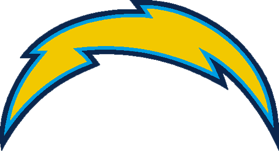
    I had recently become fond of the SanDiego chargers, but could not figure out why...

    Then I did, the colors are very similar to the Sabres...

    And the other reason I liked them is because their logo is the same shape dynamic as ours as well...

    I believe when the team was looking for a new logo, RBK execs said that this whole uniform scheme worked for the chargers so the sabres should try it out...

    The slug sucks, and I like the uniforms but I think they would look even better if the Sabres had redone them with the rest of the jerseys this year.

    The best looking jerseys in the league are the St. Louis Blues. If the sabres would have followed a similar jersey theme the new logo might have received a better response.

    I just wish I could order a Blues jersey with Sabres colors and Sabres logo on it.


  • G Wolly
    Registered User
    • Mar 2004
    • 9387

    #2
    Re: Slug logo was attempt by team to replicate SanDiego Chargers logo

    Last season when I wasnt used to the god awful logo yet, I watched some Chargers games and mistook the Chargers bolt for the slug too many times.


    Comment

    • Philagape
      WIN NOW
      • Jul 2002
      • 19432

      #3
      Re: Slug logo was attempt by team to replicate SanDiego Chargers logo

      What great rationale, if that's what it was. When I think of the words "Buffalo Sabres," the first thing I think of is a lightning bolt! It's a natural!
      "It is better to be divided by truth than to be united by error." -- Martin Luther

      "Those who appease the crocodile will simply be eaten last." -- Winston Churchill

      2003 BZ Pick Em Champion
      2004 BZ Big Money League Champion

      Comment

      • Michael82
        Registered User
        • Jul 2002
        • 82328

        #4
        Re: Slug logo was attempt by team to replicate SanDiego Chargers logo

        My theory is that the slug was an attempt by the HSBC bank to replicate the HSBC Arena logo. I have seen this logo many times when I was at the Arena for the Sabres games and always wondered. Take the slug and put it over the HSBC arena logo, it's a perfect fit.

        Choose among 31 KeyBank Center hotels in Buffalo. Use our map to check the location and pick your perfect stay. No additional fees! Best rates and secure booking.

        Comment

        • SabreEleven
          Registered User
          • Aug 2002
          • 39563

          #5
          Re: Slug logo was attempt by team to replicate SanDiego Chargers logo

          Holy **** Mikey, you are right. I'm surprised we didn't go to power blue and white on the uni's.

          Comment

          • im4bflo
            the EPITOMY of PATHETIC
            • Sep 2003
            • 7000

            #6
            Re: Slug logo was attempt by team to replicate SanDiego Chargers logo

            slug logo was an attempt to replicate the dump I just took.

            Comment

            Working...
            X