
 Tweet
Tweet
WKBW's Sports Director Shawn Stepner reported tonight on the 6 o'clock news tonight on sports that the Pegula's COULD BE changing the Bills logo back to the red standing buffalo, remember the first thing Terry Pegula did when he bought the Sabres was rid of what Sabres fans were calling the "slug" he brought back to the Sabres original logo with the blue circle with the white buffalo and the crossed sabres inside of it. The Pegula's are traditionalists.
-
-
Re: back to the red standing buffalo logo?
I love that damned standing buffalo. -
Re: back to the red standing buffalo logo?
They could run with it any time they want. We are one of the few teams that can still do throwback unis because our main helmets are the same color.
Billszone 2013 Prediction Contest winner!Comment
-
Re: back to the red standing buffalo logo?
I love the blue and red charger, with standing as the throwback.
Comment
-
Re: back to the red standing buffalo logo?
I'm open to him changing the unis again as well, but just slightly. Something is "off" about these - can't put my finger on it. I think it's maybe too many thin stripes (shoulders, socks, etc)? I actually like the one that Kemp is wearing in Oaf's sig. Thicker, single stripes.Comment
-
Re: back to the red standing buffalo logo?


Comment
-
Re: back to the red standing buffalo logo?
back when standie was the official logo ppl said they hated it bc it was too boring. now after being mothballed for a couple decades in favor of streakie ppl are saying they always preferred standie
gotta love nostalgiaOne set of rules for all in the beloved communityComment
-
Re: back to the red standing buffalo logo?
I believe at the time, we were the only sports franchise that had the symbol of city as the symbol of the team.
I love them both.
I wish that, for the next anniversary, we wear blue and silver throwbacks, from 1960 and 1961.Comment
-
Re: back to the red standing buffalo logo?
I used to hate our modern logo, and thought that it represented everything wrong with graphic design.Originally posted by Historian View Post
But the older I've gotten, the more I've fallen in love with it.
It takes a somehwat.... boring.... animal, and manages to convey power and speed, while still being representative of the city AND perfectly incorporating our color scheme. The streaming line coming from the horn is also a perfect accessory to use as a decal around the stadium, on the helmet (the center bar expanding in width from front to back), and in other ways.
The red standing buffalo is perfect 1-2 times a year as a throwback.
- - - Updated - - -
I used to hate our modern logo, and thought that it represented everything wrong with graphic design.Originally posted by Historian View Post
But the older I've gotten, the more I've fallen in love with it.
It takes a somehwat.... boring.... animal, and manages to convey power and speed, while still being representative of the city AND perfectly incorporating our color scheme. The streaming line coming from the horn is also a perfect accessory to use as a decal around the stadium, on the helmet (the center bar expanding in width from front to back), and in other ways.
The red standing buffalo is perfect 1-2 times a year as a throwback.Comment
-
Re: back to the red standing buffalo logo?
Gotta be the charging Buffalo. Standing Buffalo is nostalgic and classy, but ranks last in intimidation factor.Comment
-
Re: back to the red standing buffalo logo?
Our uniform right now is perfect. Leave it alone.
Comment
-
Re: back to the red standing buffalo logo?
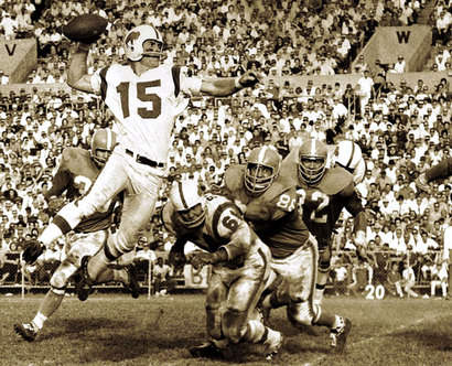
I grew up with the 90's Bills the SB years and I still hate the Bills logo that the Bills have now on their helmets, and what is it about the streak that starts from where the eye of the Buffalo is supposed to be and goes through the middle of the buffalo's body and out of it's butt. The Sabres have the perfect logo with streaks above and below the buffalo that makes it like it's charging. Also if the can go back to the Joe Namath logo and what Kevin Arnold on the Wonder Years had on his jacket why can't the Bills go back to the red standing buffalo logo.
Comment
-
Re: back to the red standing buffalo logo?
I like the current uniforms a lot and I'd be perfectly fine with staying with them.
I love the throwbacks better and I think the standing buffalo has more class, so that's my preference.Comment
-
Re: back to the red standing buffalo logo?
Intimidation is all a function of the players wearing the uniform.Originally posted by Don't Panic View PostComment
-
Re: back to the red standing buffalo logo?
No way. The rushing buffalo is so much better.Comment


Comment