My unmade bed looks more coordinated.


My unmade bed looks more coordinated.


another one snaaaaazzzzzyyyy!!!
That looks like the St. Louis Arch with a croissant sandwich dipped in a light honey mustard sauce underneath it.
It needs more dark blue
rofl
You hold a players only meeting and get each guy to stand up and say what he can bring to the table... and if he doesn't, you punch him in the face. ~~ Harry Neale, on how to fix the Sabres season.
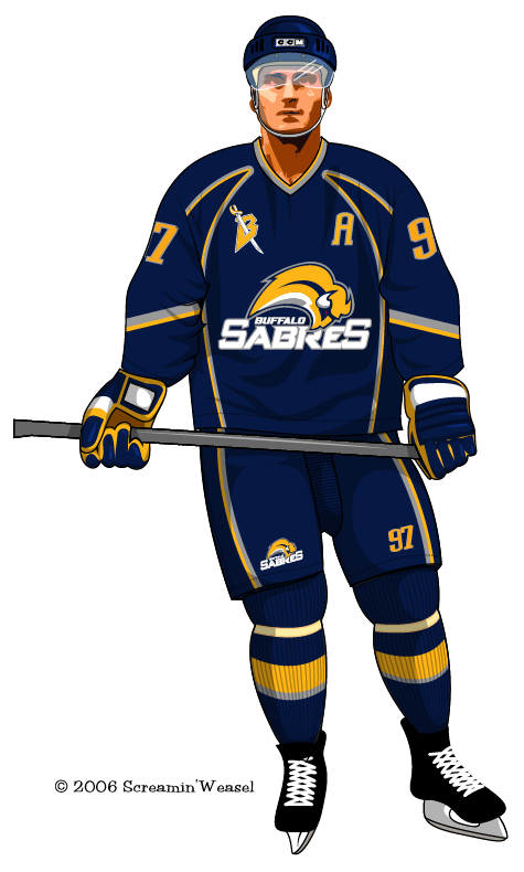
WTF??? too many logos!

we need to go back to the old school look.
Originally Posted by yordad
Laughing stock of the NHL. Until we hit the ice and start ownin *****es!!
Anyway, my friend has actually seen the jerseys and she hinted "I wouldnt be surprised if the Slug logo was on the shoulders"
So I dont even know what to think..
Just seen the news.
Lindy Ruff was wearing a navy blue hat with a piss yellow color all over it.
Disgusting.

I'm also making a new thread about this
Although the Sabres won't unveil their new uniforms until Saturday, the team is offering a sneak peek of sorts.
Rookies are already skating at HSBC Arena and they're wearing practice pants that have the new logo and colors on them.
In addition, the new logo is now painted on center ice.
http://www.wgrz.com/news/news_articl...?storyid=41122
or watch the video
Then why would they put a minor logo at center ice?
No **** dude. Nothing new. Shut up?
THATS WHAT I SAID TO HER.
And she said you'd be surprised.. I dont know about her though, shes kinda unbelievable about some things so who knows..
Not necessary, bro.
I know that jersey isn't what it's gonna be....but it looks horrible.
"And I do have a wish, albeit one that cannot and will not be fulfilled. I wish... I wish that standing next to me right now, would be Ted Darling."
Rick Jeanneret 4-14-96
Ted Darling "Voice of the Sabres"

YardRat Wall of Fame
#56 DARRYL TALLEY #29 DERRICK BURROUGHS#22 FRED JACKSON #95 KYLE WILLIAMS

That picture as a whole actually doesn't look SO awful... but damn, that Buffaslug just can't look good no matter what is done with it.
I think the slug would eventually grow on me, but the words "Buffalo Sabres" underneath make it look like a high school uni.
 Posting Permissions

 Reply With Quote