Terrible, I still blame everone who just had to have the Blue and Gold back again. We couldn't just leave the uni's alone...what next rainbow colored helmets to complete the clown outfit.


Terrible, I still blame everone who just had to have the Blue and Gold back again. We couldn't just leave the uni's alone...what next rainbow colored helmets to complete the clown outfit.
OMG that is even worse than I imagined! Larry Quinn can kiss my ass. He won't get a dime from me on any of that ****.Originally Posted by LOSman WINS

I would have rather had the Angry Goathead in blue and gold.
If they put the B on the chest, where's the Stanley Cup logo going to go?
"It is better to be divided by truth than to be united by error." -- Martin Luther
"Those who appease the crocodile will simply be eaten last." -- Winston Churchill
2003 BZ Pick Em Champion
2004 BZ Big Money League Champion
Now that's
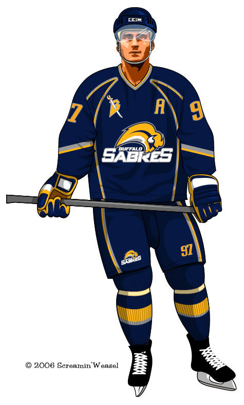
I really don't think those are the jerseys. Screaming Weasel is a poster on one of the messageboards I go to..hell he might be on this one.
I did hear something about the B being on the front. Hell, clutter the entire front of the jersey and it takes all emphasis off the friggin Slug doesn't it? CLEVER LARRY!! CLEVER!
"And I do have a wish, albeit one that cannot and will not be fulfilled. I wish... I wish that standing next to me right now, would be Ted Darling."
Rick Jeanneret 4-14-96
Ted Darling "Voice of the Sabres"

Well if she is your friend and she has seen the jerseys, why hasn't she told you what they look like?
All Buffalo had to do was take our 3rd jersey from last year and make it blue and gold. But no, they had to create this buffa****slug thing!
IF that truly is the final product, my biggest complain is the "Buffalo Sabres" below the actual logo. It seems like trying to put too much crap in too little space. If they take that part out (If it is really even there---we'll know Saturday), then I might give it the.
That is just someone's redition of what they HEARD the jersey's look like, Not official in any way.
Well according to my friend who has already seen the jersey..
"Picture the Vikings jersey, but like a royal blue"
"now add that ugly logo in and there you go"
You hold a players only meeting and get each guy to stand up and say what he can bring to the table... and if he doesn't, you punch him in the face. ~~ Harry Neale, on how to fix the Sabres season.
My friend says the B will NOT be on the front.
Thank god.
No ****! It's like they couldn't decide so they just opted to put them all on there.
The thing looks awful... like a pre-schoolers coloring assignment
Those would be great but the logo is so gay. I hate that it actually spells out the Team name on the Jersey even more than the Buffaslug itself.
Exactly this secretive crap is GAY! Just unveil the damn things already so no one will buy them and they can change them.
i doubt thats it
why is everyone throwing such a fit over something they dont even know yet
It looks like B and A nipple rings, with an alien SLUG coming out the stomach.
That's so EMBARRASSING! I'm betting that's not it.
You put the ORIGINAL logo that uni, and you've got something I could live with.
But anything even close to that joke, won't see my money!
I agree, that would be a great jersey.
I'd buy that! But the SLUG will never be worn by me!
I bet I could find a place that would remove the slug and stitch on the old crest. If so, then I'd get a jersey.
 Posting Permissions


 Reply With Quote