If this is your first visit, be sure to
check out the FAQ by clicking the
link above. You may have to register
before you can post: click the register link above to proceed. To start viewing messages,
select the forum that you want to visit from the selection below.
All: The new Billszone site with the updated software is scheduled to be turned on Tuesday, May 21, 2024. The company that built it, Dynascale, estimates a FOUR HOUR shut down, from 8pm Pacific, (5pm Eastern) while they get it up and running. Nobody will be able to post in any forum until they are done. Afterwards, you may need to do a web search for the site, as old links will not work, because the site is getting a new IP address. Please be patient. If there are bugs, we will tackle them one at a time. Remember the goal is to be up and running with no glitches by camp. Doing this now assures us of that, because it gives us all summer to get our ducks in a row. Thank you!
There is work to be done and things to be learned. We are going to try to get the old look back - or something close to it. We also know there are bugs. A thread will be started to report bugs and then we can pass those onto the host.
Thank you for all the patience and support with this - hopefully this will greatly reduce the crashes and other site issues we have had lately.
Please use this thread to report any issues you come across
http://www.billszone.com/fanzone/forum/feedback-forums/billszone-q-a/6521455-upgrade-report-bugs-here
Well, if that's the case, I think you will see a backlash and the Sabres will be proud to gloat about having the lowest merchandise sales in the league.
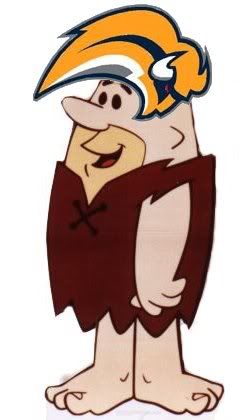
These are the ugliest logo's/uniforms I've ever seen. They are worse than Anaheims new scheme. They are even worse than Atlanta's! It looks like somebody sprayed mustard and crayola midnight blue on top of a Buffalo with mad bison disease.
I'd rather stick with the black and red than go with this garbage.
I really feel like it's some dude photoshopping to get a rise out of most of us. I won't believe anything until I hear it from the Sabres themselves. But, good god, those are just ugly.
I can't even begin to think that Tom, Darcy, or anybody within the organization would actually feel that fans would embrace such a disgusting design.
Re: They really went to the PAST with that logo.....
Originally posted by jfreeman
See what I miss sleeping at day and working at night
I reeeeealllly hope the Sabres are pulling the same thing the Bills did when they tried proposing that horrendus B morphed into a Buffalo head just to get a public response.
These designs have that Bills' design beat 10 fold in terms of hideousness. I'd rather wear the Red Alt 3rd jersey than these.
The Bills design is eerily similiar to this logo, but you are right, it's 10x better. And I never liked that logo.
I really feel like it's some dude photoshopping to get a rise out of most of us. I won't believe anything until I hear it from the Sabres themselves. But, good god, those are just ugly.
I can't even begin to think that Tom, Darcy, or anybody within the organization would actually feel that fans would embrace such a disgusting design.
sounds like the way we all felt with that Bills logo. And don't forget...there's proof they were going to use it. It was one their jersey on Madden screen shots and was also on hats that Reebok made. It just got scrapped from Bills backlash!
sounds like the way we all felt with that Bills logo. And don't forget...there's proof they were going to use it. It was one their jersey on Madden screen shots and was also on hats that Reebok made. It just got scrapped from Bills backlash!
I remember seeing those hats. You can still find them on ebay every now and then.
Also, what's with the obsession with these new "modern logos". Eagles, panthers, jaguars, thrashers, predators... they all look the same. I don't get it? I think they all look ******ed.
I remember seeing those hats. You can still find them on ebay every now and then.
Also, what's with the obsession with these new "modern logos". Eagles, panthers, jaguars, thrashers, predators... they all look the same. I don't get it? I think they all look ******ed.
Think about it, what else can you possibly make that wont look like any of the others.
Lets help the Sabres out.. Open up paint, and draw what you want the BUFFALO SABRES logo to look like. Were the Buffalo SABRES, not the Sabre Buffaloes... We need a Sabre in there somewhere..
“You hold a players only meeting and get each guy to stand up and say what he can bring to the table... and if he doesn't, you punch him in the face.” ~~ Harry Neale, on how to fix the Sabres season.
And mikey did you reallllly need to make 5 consecutive posts?
“You hold a players only meeting and get each guy to stand up and say what he can bring to the table... and if he doesn't, you punch him in the face.” ~~ Harry Neale, on how to fix the Sabres season.


 Tweet
Tweet


Comment