Originally Posted by jfreeman


Wow! 100 ZBs???!?That's a lot of money!

Let me know what you think. I know it's similar to the one that we've all seen today. I hope you like it.

Last edited by jfreeman; 06-28-2006 at 07:50 PM.
AWESOME!!!!


Nice
YardRat Wall of Fame
#56 DARRYL TALLEY #29 DERRICK BURROUGHS#22 FRED JACKSON #95 KYLE WILLIAMS

STOP MERGING THE ****ING THREADS! jesus. you guys have been doing this all week!!!!!!!!!!


HEY!it wasidea!

Last edited by BillsSabresB.C.T. Fan; 06-29-2006 at 08:19 PM.
here ya go.... a friend of mine found it...
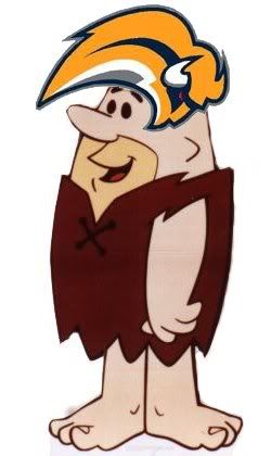
like the colors... hate the logo
yeahthe colors are great, the logo isnt half bad but could use some work,
as for the threads bing merged, read the other post about it... cheers...
I liked the goat head.... but that's just me. if this is the one they pick, I don't know that I'll jump on thebut it might grow on me.... I would really like to see some type of play off of both the old blue and gold jerseys and the red and black ones....
That logo might look good on top of the standings :) haha..
maybe if they curve it more and make it more like the previous goathead...
You are on.
The original logos posted were horrendous!
At least this pic looks better.
Zapper's Hit List:
SABURZFAN -
SabreEleven -
pjw aka Mini -
Billsology -
Join BDZ today!!!
http://www.billszone.com/http://www....ad.php?t=72979
I still cant believe how horrendous they look.
Heres a couple problems with these jerseys that makes me believe they are NOT real:
- Why would the NHL slap "CONFIDENTIAL" over the logos if it needed to show them to venders/video game makers, etc.?
-The jersey has a CCM tag. All NHL jerseys, other than the Canadiens (and maybe one or two others) now have Reebok tags. There's also some weird effect going on with that CCM tag that I'm having trouble putting to words.
-The stripe pattern along the sides looks like it was just drawn on using Paint or some other program. Notice how the seem across the bottom in the white section of the jersey disappears in the darker colors.
it looks better because it's been missing something IMO. At least with the sabres in it, it makes it a little more balanced.
The jersey was just put together from a fan who wanted to see what it might look like. The logos are the only thing people are claiming to be real.
Buffalo News confirms the logo
http://www.buffalonews.com/editorial...30/1025590.asp
That logo sucks. A buffalo with no legs?? The goat head is better.
"It is better to be divided by truth than to be united by error." -- Martin Luther
"Those who appease the crocodile will simply be eaten last." -- Winston Churchill
2003 BZ Pick Em Champion
2004 BZ Big Money League Champion
 Posting Permissions


 Reply With Quote