If this is your first visit, be sure to
check out the FAQ by clicking the
link above. You may have to register
before you can post: click the register link above to proceed. To start viewing messages,
select the forum that you want to visit from the selection below.
All: The new Billszone site with the updated software is scheduled to be turned on Tuesday, May 21, 2024. The company that built it, Dynascale, estimates a FOUR HOUR shut down, from 8pm Pacific, (5pm Eastern) while they get it up and running. Nobody will be able to post in any forum until they are done. Afterwards, you may need to do a web search for the site, as old links will not work, because the site is getting a new IP address. Please be patient. If there are bugs, we will tackle them one at a time. Remember the goal is to be up and running with no glitches by camp. Doing this now assures us of that, because it gives us all summer to get our ducks in a row. Thank you!
There is work to be done and things to be learned. We are going to try to get the old look back - or something close to it. We also know there are bugs. A thread will be started to report bugs and then we can pass those onto the host.
Thank you for all the patience and support with this - hopefully this will greatly reduce the crashes and other site issues we have had lately.
Please use this thread to report any issues you come across
http://www.billszone.com/fanzone/forum/feedback-forums/billszone-q-a/6521455-upgrade-report-bugs-here
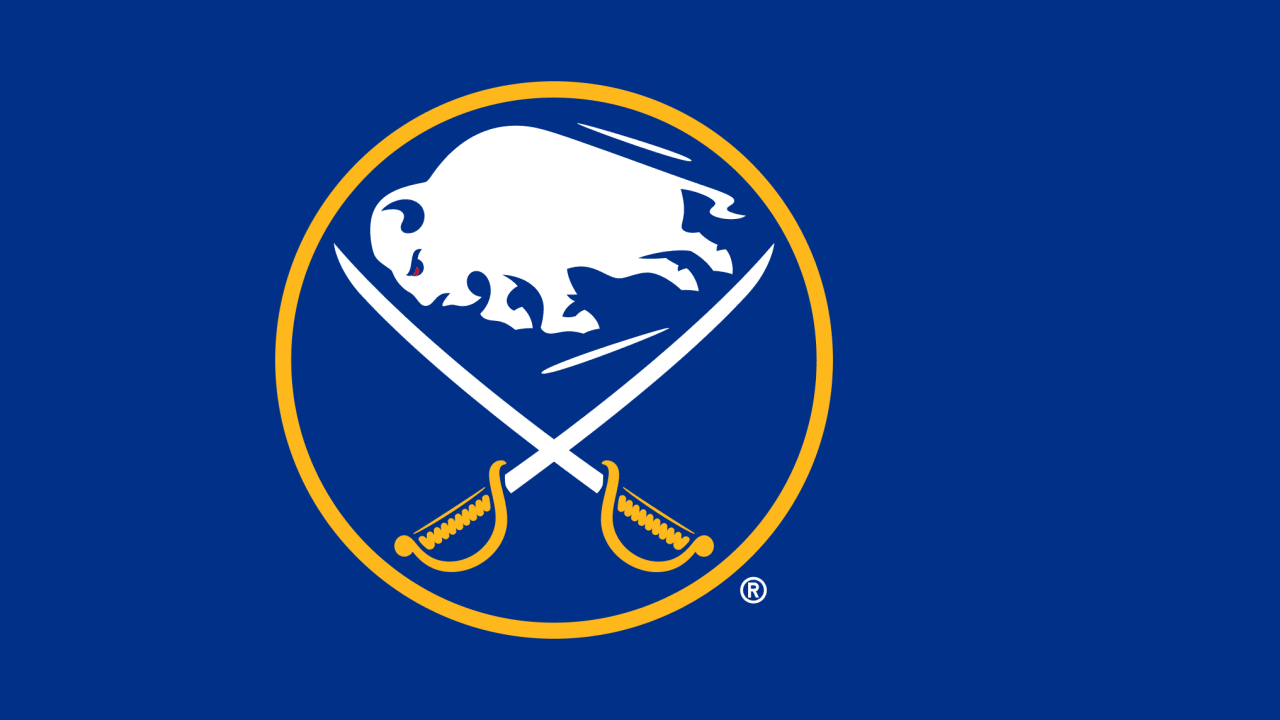
yeahthe colors are great, the logo isnt half bad but could use some work,
as for the threads bing merged, read the other post about it... cheers...
I liked the goat head.... but that's just me. if this is the one they pick, I don't know that I'll jump on the but it might grow on me.... I would really like to see some type of play off of both the old blue and gold jerseys and the red and black ones....
2008-2009 BZHL Champion!
2008 Pro Football Pick 'em Champion!
2008 Survival Football Co-Champion!
2006-2007 3 Star Pick 'em Champion!
I liked the goat head.... but that's just me. if this is the one they pick, I don't know that I'll jump on the but it might grow on me.... I would really like to see some type of play off of both the old blue and gold jerseys and the red and black ones....
That logo might look good on top of the standings :) haha..
maybe if they curve it more and make it more like the previous goathead...
Heres a couple problems with these jerseys that makes me believe they are NOT real:
- Why would the NHL slap "CONFIDENTIAL" over the logos if it needed to show them to venders/video game makers, etc.?
-The jersey has a CCM tag. All NHL jerseys, other than the Canadiens (and maybe one or two others) now have Reebok tags. There's also some weird effect going on with that CCM tag that I'm having trouble putting to words.
-The stripe pattern along the sides looks like it was just drawn on using Paint or some other program. Notice how the seem across the bottom in the white section of the jersey disappears in the darker colors.
The jersey was just put together from a fan who wanted to see what it might look like. The logos are the only thing people are claiming to be real.
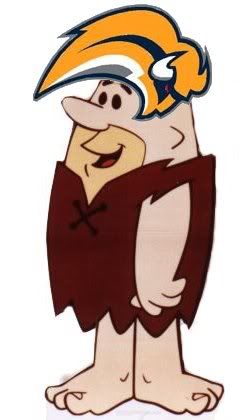
jesus christ. i just woke up to a call from my gf who is livid. she is telling me the BUF News has confirmed that croissant sandwich as the new logo???
WTF!!!!
After this past season is the FO trying to piss off the fans who supported this team the past decade through pure and utter crap by:
-not resigning guys
-building up the fans to a new logo, only to give us a breakfast sandwich that looks like a furry squirrel mullet?
i cannot believe this.
I know damn well that I won't spend a ****ing dime on anything with that logo and I emailed the Sabres to let them know. I suggest everybody else do the same thing.
I know damn well that I won't spend a ****ing dime on anything with that logo and I emailed the Sabres to let them know. I suggest everybody else do the same thing.
Well, I thought it was a joke when I first saw the new logo. Now I am hearing it is the real deal.
I cannot tell you how disappointed I will be if this furry, leg-less "Buffalo", which looks more like a Croissant Breakfast sandwich than a real animal, is in fact the new face of the Buffalo Sabres.
As a lifelong Sabres fan, I worked several hours of overtime in anticipation of being amongst the first to purchase a new sweater. Instead, I will end up using the money to take my gf out to a nice dinner, rather than spend it on a sweater with a glorified breakfast sandwich highlighted by some blue stripes and a horn.
PLEASE - DO NOT EMBARRASS THE SABRES AND THEIR FANS by using this disgusting, legless, mulleted, squirrel-like, breakfast sandwich as the new logo. It resembles the Sabres, their fans, and the people of Buffalo in no way, shape, or form. I'd rather see a Star Wars light sabre on a purple shirt instead of this!


 Tweet
Tweet
 but it might grow on me.... I would really like to see some type of play off of both the old blue and gold jerseys and the red and black ones....


Comment