If this is your first visit, be sure to
check out the FAQ by clicking the
link above. You may have to register
before you can post: click the register link above to proceed. To start viewing messages,
select the forum that you want to visit from the selection below.
All: The new Billszone site with the updated software is scheduled to be turned on Tuesday, May 21, 2024. The company that built it, Dynascale, estimates a FOUR HOUR shut down, from 8pm Pacific, (5pm Eastern) while they get it up and running. Nobody will be able to post in any forum until they are done. Afterwards, you may need to do a web search for the site, as old links will not work, because the site is getting a new IP address. Please be patient. If there are bugs, we will tackle them one at a time. Remember the goal is to be up and running with no glitches by camp. Doing this now assures us of that, because it gives us all summer to get our ducks in a row. Thank you!
There is work to be done and things to be learned. We are going to try to get the old look back - or something close to it. We also know there are bugs. A thread will be started to report bugs and then we can pass those onto the host.
Thank you for all the patience and support with this - hopefully this will greatly reduce the crashes and other site issues we have had lately.
Please use this thread to report any issues you come across
http://www.billszone.com/fanzone/forum/feedback-forums/billszone-q-a/6521455-upgrade-report-bugs-here
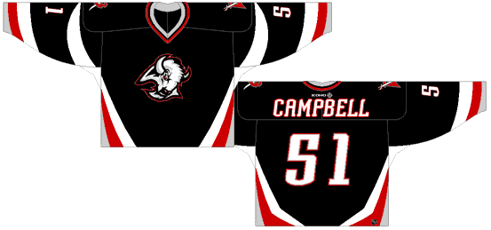
Isnt there an addy we can email them to tell them how awful it looks. My friend thinks if enough emails are sent,you never know. Probably do no good,but I would like to show them that this logo would be much better:
Isnt there an addy we can email them to tell them how awful it looks. My friend thinks if enough emails are sent,you never know. Probably do no good,but I would like to show them that this logo would be much better:
This looks much better but I still can't get over the fact that it has no legs... Who is the dummy who came up with this?
Hello. As a huge Sabres fan and in regards to the new Sabres logo - it is HORRENDOUS!!! We are the Buffalo Sabres and just having the swords on the shoulders just doesnt cut it. The swords need to be on the front. At least THIS logo is tolerable:
Please take this into consideration before going any further,because I will not be purchasing any of this new merchandise. Thank you and GO SABRES!!!
Also, Has it ever Occured to you guys that they can say this is final all they want, but untill the new jerseys unviel in september they can change them...
For all you know they released this goathead crap to get our $.02 and half of you recent photoshops of old logos will end up being ripped off and used :)
Well, I thought it was a joke when I first saw the new logo. Now I am hearing it is the real deal.
I cannot tell you how disappointed I will be if this furry, leg-less "Buffalo", which looks more like a Croissant Breakfast sandwich than a real animal, is in fact the new face of the Buffalo Sabres.
As a lifelong Sabres fan, I worked several hours of overtime in anticipation of being amongst the first to purchase a new sweater. Instead, I will end up using the money to take my gf out to a nice dinner, rather than spend it on a sweater with a glorified breakfast sandwich highlighted by some blue stripes and a horn.
PLEASE - DO NOT EMBARRASS THE SABRES AND THEIR FANS by using this disgusting, legless, mulleted, squirrel-like, breakfast sandwich as the new logo. It resembles the Sabres, their fans, and the people of Buffalo in no way, shape, or form. I'd rather see a Star Wars light sabre on a purple shirt instead of this!
 Tweet
Tweet
 That is terrible.


Comment