"It is better to be divided by truth than to be united by error." -- Martin Luther
"Those who appease the crocodile will simply be eaten last." -- Winston Churchill
2003 BZ Pick Em Champion
2004 BZ Big Money League Champion
That hurts my eyes.
"There ought to be a room in every house to swear in. It's dangerous to have to repress an emotion like that." - Mark Twain

Is that from the new Dark Knight movie?
YardRat Wall of Fame
#56 DARRYL TALLEY #29 DERRICK BURROUGHS#22 FRED JACKSON #95 KYLE WILLIAMS

Australian rules referee...

That's terrible. Whoever designed that needs to be fired.
They are going to look like a bunch of Crash Test Dummies out there.
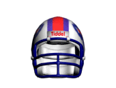
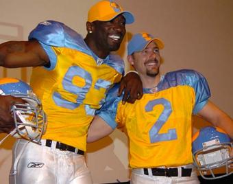
Worst uniform ever.

OMG - it looks like a caution sign at a road construction project.
Fiat justitia ruat caelum. Noli timere. Laus Deo.
Or a bumble bee with a speed limit sign glued to his ass
It looks like a bumble bee and the numbers look like wings lol
Not here to be right, just here to have interesting discussions about my impulsive opinions
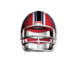
That thing is sick I don't know what you all are talking about. the rectangles around the number look really cool

Last edited by Buffalogic; 04-18-2012 at 09:49 PM.
this is still the worst
I like it.
COMING SOON...
Originally Posted by Dr.Lecter
I'll raise you...
Thread says "football," not NFL.
-Bill
The original Broncos jerseys take the cake.
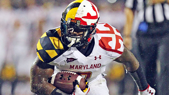
the broncos throwback is cool too. The socks are legit. Terapins, well they are just trying too hard.

wow...lots of bad ideas in this thread.
The Jets throwback Titan jerseys look like someone took a dump and wiped it on a shirt and then slapped numbers on the back.
Nah, the Seahawks' neon green effort is still by far the worst.

 Posting Permissions


 Reply With Quote