Page 1 of 2 12 LastLast
Results 1 to 20 of 29

Thread: New "Goat head' Throwback Sabres Logo Design. Yay or Nay?

  1. #1
    HI I AM A FREAKING LIONS FAN
    Join Date
    Mar 2005
    Posts
    5,511
    Thanks
    165
    Thanked 48 Times in 39 Posts
    Power to Give Rep
    32

    New "Goat head' Throwback Sabres Logo Design. Yay or Nay?

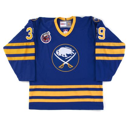
    Check out this design of the revamped "Goat head" Sabres logo, it's really not bad and I can see it as an alternate third jersey. Definitely better looking than the red and black version. Bleeeech!!!!

    http://imgur.com/a/fDJzu.
    Let's Go Bills, make it happen!!!

  2. Post thanked by:

    elltrain22 (04-15-2016)

  3. #2
    Legendary Zoner trapezeus's Avatar
    Join Date
    Oct 2004
    Location
    NYC
    Posts
    19,525
    Thanks
    4,356
    Thanked 3,218 Times in 1,859 Posts
    Power to Give Rep
    67

    Re: New "Goat head' Throwback Sabres Logo Design. Yay or Nay?

    after living through 2 bad non-sabre logos, why mess it up again?

  4. #3
    Well, lookie here... YardRat's Avatar
    Join Date
    Dec 2004
    Location
    A hole in your wall.
    Posts
    85,807
    Thanks
    30,518
    Thanked 30,528 Times in 17,421 Posts
    Power to Give Rep
    243

    Re: New "Goat head' Throwback Sabres Logo Design. Yay or Nay?

    I liked the red and black uni's actually, but the classic version is just so cool they should stick with it. If they feel the necessity for a third jersey just do a slight variation of the original.
    YardRat Wall of Fame
    #56 DARRYL TALLEY
    #29 DERRICK BURROUGHS#22 FRED JACKSON #95 KYLE WILLIAMS

  5. Post thanked by:

    feldspar (04-18-2016),OpIv37 (04-13-2016),WagonCircler (04-12-2016)

  6. #4
    Registered User
    Join Date
    Aug 2012
    Location
    grand rapids
    Posts
    58,810
    Thanks
    12,164
    Thanked 16,493 Times in 12,035 Posts
    Power to Give Rep
    141

    Re: New "Goat head' Throwback Sabres Logo Design. Yay or Nay?

    See, I like the current logo, but always loved the goat head in current colors. That said, the current home Jersey is boring. Maybe make the shoulders yellow or something?
    Flag of Ukraine.svg

  7. #5
    Registered User sukie's Avatar
    Join Date
    Sep 2012
    Posts
    21,297
    Thanks
    4,498
    Thanked 9,153 Times in 5,890 Posts
    Power to Give Rep
    63

    Re: New "Goat head' Throwback Sabres Logo Design. Yay or Nay?

    The NHL should go back to the way it was traditionally and screw what other sports do...
    "whites" at home and so called boring colors for the road.

  8. Post thanked by:

    Dude (04-13-2016),gebobs (04-12-2016),JATMtheJATM (04-11-2016),trapezeus (04-13-2016)

  9. #6
    One Bills Drive, Georgia - 871 miles south of Orchard Park gebobs's Avatar
    Join Date
    Sep 2003
    Location
    Atlanta
    Posts
    11,520
    Thanks
    6,740
    Thanked 6,455 Times in 3,965 Posts
    Power to Give Rep
    46

    Re: New "Goat head' Throwback Sabres Logo Design. Yay or Nay?

    I honestly can't think of any way to make the Sabres blue unis better. Way too blue.
    Lehner's history. He just doesn't know it yet.

  10. #7
    Registered User
    Join Date
    Aug 2012
    Location
    grand rapids
    Posts
    58,810
    Thanks
    12,164
    Thanked 16,493 Times in 12,035 Posts
    Power to Give Rep
    141

    Re: New "Goat head' Throwback Sabres Logo Design. Yay or Nay?

    Quote Originally Posted by gebobs View Post
    I honestly can't think of any way to make the Sabres blue unis better. Way too blue.
    Little more yellow would be nice. Yellow shoulder patches, imo
    Last edited by JATMtheJATM; 04-12-2016 at 05:52 PM.

  11. #8
    Zamboni Driver rbochan's Avatar
    Join Date
    Jun 2008
    Location
    Syracuse, NY
    Posts
    5,060
    Thanks
    242
    Thanked 470 Times in 305 Posts
    Power to Give Rep
    30

    Re: New "Goat head' Throwback Sabres Logo Design. Yay or Nay?

    Quote Originally Posted by gebobs View Post
    I honestly can't think of any way to make the Sabres blue unis better. Way too blue.
    Make them the original blue.

    ...Rob

    The American Dream isn't an SUV and a house in the suburbs;
    it's Don't Tread On Me.

  12. Post thanked by:

    coastal (04-13-2016),Dr. Who (04-14-2016),gebobs (04-13-2016),sukie (04-13-2016),YardRat (04-13-2016)

  13. #9
    that slimey ass of an admin at the zone Dude's Avatar
    Join Date
    Feb 2005
    Location
    Your world frightens and confuses me
    Posts
    18,176
    Thanks
    5,073
    Thanked 4,563 Times in 2,509 Posts
    Power to Give Rep
    139

    Re: New "Goat head' Throwback Sabres Logo Design. Yay or Nay?

    Quote Originally Posted by JATMtheJATM View Post
    See, I like the current logo, but always loved the goat head in current colors. That said, the current home Jersey is boring. Maybe make the shoulders yellow or something?
    I hope the Sabres do the smart thing and don't start ****ing with the uniforms again aside from minor tweaks.

  14. Post thanked by:

    chernobylwraiths (04-14-2016),Night Train (04-14-2016),WagonCircler (04-13-2016)

  15. #10
    Registered User sukie's Avatar
    Join Date
    Sep 2012
    Posts
    21,297
    Thanks
    4,498
    Thanked 9,153 Times in 5,890 Posts
    Power to Give Rep
    63

    Re: New "Goat head' Throwback Sabres Logo Design. Yay or Nay?

    Quote Originally Posted by rbochan View Post
    Make them the original blue.

    truly beautiful. If only they could bring back a kick ass French speaking line and nick name it after a great movie..... Any thoughts?

  16. Post thanked by:

    chernobylwraiths (04-14-2016),Dr. Who (04-14-2016)

  17. #11
    One Bills Drive, Georgia - 871 miles south of Orchard Park gebobs's Avatar
    Join Date
    Sep 2003
    Location
    Atlanta
    Posts
    11,520
    Thanks
    6,740
    Thanked 6,455 Times in 3,965 Posts
    Power to Give Rep
    46

    Re: New "Goat head' Throwback Sabres Logo Design. Yay or Nay?

    Quote Originally Posted by rbochan View Post
    Make them the original blue.

    Is that lighter than the blues now? It's hard for me to tell. Maybe keep the darker blues for the pants and the original blues for the socks and jersey like St. Louie?

  18. #12
    Legendary Zoner trapezeus's Avatar
    Join Date
    Oct 2004
    Location
    NYC
    Posts
    19,525
    Thanks
    4,356
    Thanked 3,218 Times in 1,859 Posts
    Power to Give Rep
    67

    Re: New "Goat head' Throwback Sabres Logo Design. Yay or Nay?

    Quote Originally Posted by gebobs View Post
    I honestly can't think of any way to make the Sabres blue unis better. Way too blue.
    white shell/pants. no one does that. then the blue pops.

  19. #13
    Registered User
    Join Date
    Aug 2012
    Location
    grand rapids
    Posts
    58,810
    Thanks
    12,164
    Thanked 16,493 Times in 12,035 Posts
    Power to Give Rep
    141

    Re: New "Goat head' Throwback Sabres Logo Design. Yay or Nay?

    Quote Originally Posted by trapezeus View Post
    white shell/pants. no one does that. then the blue pops.
    I think blue pants with a large, single yellow stripe up the side (think red wings template) would be perfect

  20. #14
    Nobody in Hawaii wears a tie. DetDannyWilliams's Avatar
    Join Date
    Feb 2013
    Posts
    4,186
    Thanks
    168
    Thanked 977 Times in 669 Posts
    Power to Give Rep
    20

    Re: New "Goat head' Throwback Sabres Logo Design. Yay or Nay?

    Quote Originally Posted by rbochan View Post
    Make them the original blue.

    I was at the uniform unveiling at the Aud which only held standing room, but did you know that the goathead was only half of the jersey there was supposed to be more to the jersey. According to Seymour Knox's wife Jean before she passed she said that "Seymour loved his team and the colors Blue and Gold, he wanted to keep the jersey Blue and Gold he only wanted to tweak the logo by having a new buffalo in between the crossed Sabres which was where the goathead was supposed to go" (if you take out the white streaking buffalo and put the goathead in between the crossed sabres you can see that it should fit perfectly like a puzzle piece) as for the change to the Red and Black the excuse given was other NHL teams where wearing red and black at the time wrong the REAL reason why the Sabres changed the colors because they were going to be sold to the Rigas's and Adelphia's colors were red and black. The late Seymour Knox III passed away before the first ever game was played in the arena

  21. #15
    Registered User
    Join Date
    Aug 2012
    Location
    grand rapids
    Posts
    58,810
    Thanks
    12,164
    Thanked 16,493 Times in 12,035 Posts
    Power to Give Rep
    141

    Re: New "Goat head' Throwback Sabres Logo Design. Yay or Nay?

    I loved the third jersey the sabres used a few years ago, with the script "buffalo"... that was a great jersey

  22. Post thanked by:

    YardRat (04-13-2016)

  23. #16
    that slimey ass of an admin at the zone Dude's Avatar
    Join Date
    Feb 2005
    Location
    Your world frightens and confuses me
    Posts
    18,176
    Thanks
    5,073
    Thanked 4,563 Times in 2,509 Posts
    Power to Give Rep
    139

    Re: New "Goat head' Throwback Sabres Logo Design. Yay or Nay?

    Quote Originally Posted by DetDannyWilliams View Post
    I was at the uniform unveiling at the Aud which only held standing room, but did you know that the goathead was only half of the jersey there was supposed to be more to the jersey. According to Seymour Knox's wife Jean before she passed she said that "Seymour loved his team and the colors Blue and Gold, he wanted to keep the jersey Blue and Gold he only wanted to tweak the logo by having a new buffalo in between the crossed Sabres which was where the goathead was supposed to go" (if you take out the white streaking buffalo and put the goathead in between the crossed sabres you can see that it should fit perfectly like a puzzle piece) as for the change to the Red and Black the excuse given was other NHL teams where wearing red and black at the time wrong the REAL reason why the Sabres changed the colors because they were going to be sold to the Rigas's and Adelphia's colors were red and black. The late Seymour Knox III passed away before the first ever game was played in the arena
    Jean Knox used the word "goathead"?

  24. #17
    Retired - On Several Levels Night Train's Avatar
    Join Date
    Jul 2005
    Location
    The Last Depot
    Posts
    33,117
    Thanks
    9,387
    Thanked 14,240 Times in 7,618 Posts
    Power to Give Rep
    126

    Re: New "Goat head' Throwback Sabres Logo Design. Yay or Nay?

    Quote Originally Posted by Dude View Post
    Jean Knox used the word "goathead"?
    Her dying words. It was the name of her doll as a child, like " Rosebud " was the name of Charles Foster Kane's sled.

  25. Post thanked by:

    Dude (04-14-2016),gebobs (04-14-2016),trapezeus (04-15-2016)

  26. #18
    Zamboni Driver rbochan's Avatar
    Join Date
    Jun 2008
    Location
    Syracuse, NY
    Posts
    5,060
    Thanks
    242
    Thanked 470 Times in 305 Posts
    Power to Give Rep
    30

    Re: New "Goat head' Throwback Sabres Logo Design. Yay or Nay?

    Quote Originally Posted by Night Train View Post
    Her dying words. It was the name of her doll as a child, like " Rosebud " was the name of Charles Foster Kane's sled.
    GOD DAMMIT!
    We need spoiler tags!


    :P

  27. Post thanked by:

    sukie (04-15-2016)

  28. #19
    Registered User elltrain22's Avatar
    Join Date
    Sep 2003
    Location
    Welcome, NC
    Posts
    4,281
    Thanks
    217
    Thanked 244 Times in 131 Posts
    Power to Give Rep
    30

    Re: New "Goat head' Throwback Sabres Logo Design. Yay or Nay?

    The Buffalo Unie needs not ever to be tweeked. If they wanted to do a third jersey, I'm cool with that, but our jerseys are awesome as is. BTW, I loved your concepts!!! Loved the Nashville guitar pick logo, the red wings/tigers hybrid logo, la kings unies, old school minnesota colors, carolina canes revamped logo, and washington unies!! GREAT, great work!! Do you do baseball, nfl, nba??
    If you walk with Jesus today, you don't have anything to worry about tomorrow...

  29. #20
    Legendary Zoner trapezeus's Avatar
    Join Date
    Oct 2004
    Location
    NYC
    Posts
    19,525
    Thanks
    4,356
    Thanked 3,218 Times in 1,859 Posts
    Power to Give Rep
    67

    Re: New "Goat head' Throwback Sabres Logo Design. Yay or Nay?

    I could do without the grey armpits on the white jersey's currently. but I agree. the logo is solid and the colors are excellent.

Posting Permissions

  • You may not post new threads
  • You may not post replies
  • You may not post attachments
  • You may not edit your posts
  •