I like the backs, i hate the fronts.
Based upon this uniform. Looks too much like the Jets "Titans" alternate.

Back looks like a vintage Wolverine. Dislike. However, I like the fronts and they are much better than those awful Jets throwbacks..
that's got to be the ugliest uniform i have ever seen........it's a close call between these and the jets'
Last edited by BertSquirtgum; 03-14-2010 at 02:36 PM.
i think i just threw up in my mouth. Looks like sesame street designed them. shapes and colors and numbers...wonderful!!!
Last edited by SaviorEdwards; 03-14-2010 at 02:41 PM.
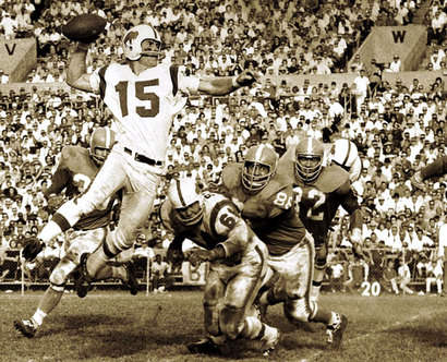
"The best things to happen to Michigan Football have come from Ohio." - Chris Spielman
It's like having bullseyes on their chests.
Sharp
hideous
Originally Posted by HurkeyNuts
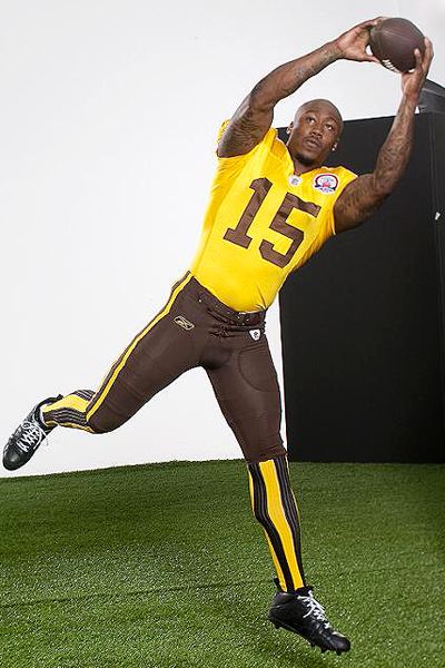

pretty awful, but there are jersey fantatics out there that help push the sales of these things....nfl continuously tapping into all the different segments of their market
gross
Jeremy Cupp
Super Fantastic!
Definitely a YaY!

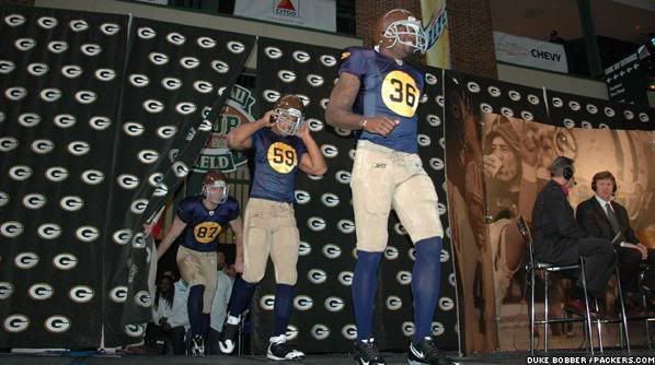
At least they can have no excuses about whose number was called.
honorable mention also to the eagles that look like some sort of photo negative version of the Michigan unis
WOW!!!! Those are SHARP.
or

Last edited by tat2dmike77; 03-14-2010 at 10:41 PM.
I dont like that color helemet... It look like brown shlt
 Posting Permissions


 Reply With Quote