Page 1 of 3 123 LastLast
Results 1 to 20 of 53

Thread: back to the red standing buffalo logo?

  1. #1
    Nobody in Hawaii wears a tie. DetDannyWilliams's Avatar
    Join Date
    Feb 2013
    Posts
    4,186
    Thanks
    168
    Thanked 977 Times in 669 Posts
    Power to Give Rep
    20

    back to the red standing buffalo logo?

    WKBW's Sports Director Shawn Stepner reported tonight on the 6 o'clock news tonight on sports that the Pegula's COULD BE changing the Bills logo back to the red standing buffalo, remember the first thing Terry Pegula did when he bought the Sabres was rid of what Sabres fans were calling the "slug" he brought back to the Sabres original logo with the blue circle with the white buffalo and the crossed sabres inside of it. The Pegula's are traditionalists.

  2. Post thanked by:

    black N yellow (12-29-2014),Dr. Who (12-30-2014),HAMMER (12-30-2014),starrymessenger (12-31-2014),WagonCircler (12-29-2014)

  3. #2
    Making Spirits Bright Joe Fo Sho's Avatar
    Join Date
    Mar 2006
    Posts
    6,194
    Thanks
    1,272
    Thanked 3,595 Times in 1,857 Posts
    Power to Give Rep
    34

    Re: back to the red standing buffalo logo?

    I love that damned standing buffalo.

  4. Post thanked by:

    Dr. Who (12-30-2014),l3ills (12-30-2014),Night Train (12-30-2014),WagonCircler (12-29-2014)

  5. #3
    Registered User IlluminatusUIUC's Avatar
    Join Date
    Sep 2012
    Location
    Chicago, Killinois
    Posts
    8,966
    Thanks
    3,129
    Thanked 6,165 Times in 3,360 Posts
    Power to Give Rep
    31

    Re: back to the red standing buffalo logo?

    They could run with it any time they want. We are one of the few teams that can still do throwback unis because our main helmets are the same color.


    Billszone 2013 Prediction Contest winner!

  6. #4
    Do you read what you write? Oaf's Avatar
    Join Date
    Jun 2007
    Location
    Grand Rapids
    Posts
    6,151
    Thanks
    1,235
    Thanked 908 Times in 552 Posts
    Power to Give Rep
    31

    Re: back to the red standing buffalo logo?

    I love the blue and red charger, with standing as the throwback.

  7. Post thanked by:

    better days (12-30-2014),djjimkelly (12-30-2014),Don't Panic (12-30-2014),Jeff1220 (12-30-2014),Meathead (12-30-2014),Thurmal (12-30-2014)

  8. #5
    Maybe? Mr. Cynical's Avatar
    Join Date
    Oct 2003
    Location
    NYC
    Posts
    9,766
    Thanks
    1,182
    Thanked 486 Times in 283 Posts
    Power to Give Rep
    43

    Re: back to the red standing buffalo logo?

    I'm open to him changing the unis again as well, but just slightly. Something is "off" about these - can't put my finger on it. I think it's maybe too many thin stripes (shoulders, socks, etc)? I actually like the one that Kemp is wearing in Oaf's sig. Thicker, single stripes.

  9. #6
    Registered User
    Join Date
    Sep 2010
    Location
    Sparing my telomeres
    Posts
    33,105
    Thanks
    15,700
    Thanked 13,409 Times in 9,123 Posts
    Power to Give Rep
    0

    Re: back to the red standing buffalo logo?


  10. Post thanked by:

    l3ills (12-30-2014)

  11. #7
    Insufferable prick and perpetual crybaby Meathead's Avatar
    Join Date
    Jul 2002
    Location
    Outer space
    Posts
    21,349
    Thanks
    3,655
    Thanked 3,785 Times in 2,047 Posts
    Power to Give Rep
    78

    Re: back to the red standing buffalo logo?

    back when standie was the official logo ppl said they hated it bc it was too boring. now after being mothballed for a couple decades in favor of streakie ppl are saying they always preferred standie

    gotta love nostalgia
    One set of rules for all in the beloved community

  12. Post thanked by:

    better days (12-30-2014),Night Train (12-30-2014)

  13. #8
    2020-2023 AFC East Champions! Historian's Avatar
    Join Date
    Dec 2002
    Location
    Upstairs
    Posts
    61,705
    Thanks
    33,038
    Thanked 28,539 Times in 15,614 Posts
    Power to Give Rep
    207

    Re: back to the red standing buffalo logo?

    I believe at the time, we were the only sports franchise that had the symbol of city as the symbol of the team.

    I love them both.

    I wish that, for the next anniversary, we wear blue and silver throwbacks, from 1960 and 1961.

  14. Post thanked by:

    better days (12-30-2014),djjimkelly (12-30-2014)

  15. #9
    Registered User
    Join Date
    Dec 2008
    Posts
    361
    Thanks
    2
    Thanked 278 Times in 139 Posts
    Power to Give Rep
    16

    Re: back to the red standing buffalo logo?

    Quote Originally Posted by Historian View Post
    I believe at the time, we were the only sports franchise that had the symbol of city as the symbol of the team.

    I love them both.

    I wish that, for the next anniversary, we wear blue and silver throwbacks, from 1960 and 1961.
    I used to hate our modern logo, and thought that it represented everything wrong with graphic design.

    But the older I've gotten, the more I've fallen in love with it.

    It takes a somehwat.... boring.... animal, and manages to convey power and speed, while still being representative of the city AND perfectly incorporating our color scheme. The streaming line coming from the horn is also a perfect accessory to use as a decal around the stadium, on the helmet (the center bar expanding in width from front to back), and in other ways.

    The red standing buffalo is perfect 1-2 times a year as a throwback.

    - - - Updated - - -

    Quote Originally Posted by Historian View Post
    I believe at the time, we were the only sports franchise that had the symbol of city as the symbol of the team.

    I love them both.

    I wish that, for the next anniversary, we wear blue and silver throwbacks, from 1960 and 1961.
    I used to hate our modern logo, and thought that it represented everything wrong with graphic design.

    But the older I've gotten, the more I've fallen in love with it.

    It takes a somehwat.... boring.... animal, and manages to convey power and speed, while still being representative of the city AND perfectly incorporating our color scheme. The streaming line coming from the horn is also a perfect accessory to use as a decal around the stadium, on the helmet (the center bar expanding in width from front to back), and in other ways.

    The red standing buffalo is perfect 1-2 times a year as a throwback.

  16. Post thanked by:

    better days (12-30-2014),DraftBoy (12-30-2014),Meathead (12-30-2014)

  17. #10
    All-Pro Zoner Don't Panic's Avatar
    Join Date
    Dec 2005
    Location
    Raleigh, North Carolina, United States
    Posts
    4,227
    Thanks
    1,092
    Thanked 530 Times in 283 Posts
    Power to Give Rep
    28

    Re: back to the red standing buffalo logo?

    Gotta be the charging Buffalo. Standing Buffalo is nostalgic and classy, but ranks last in intimidation factor.

  18. #11
    Registered User jamze132's Avatar
    Join Date
    Jun 2003
    Location
    Virginia
    Posts
    29,291
    Thanks
    7,848
    Thanked 5,942 Times in 3,562 Posts
    Power to Give Rep
    104

    Re: back to the red standing buffalo logo?

    Our uniform right now is perfect. Leave it alone.

  19. Post thanked by:

    better days (12-30-2014),The last buffalo fan (12-30-2014)

  20. #12
    Nobody in Hawaii wears a tie. DetDannyWilliams's Avatar
    Join Date
    Feb 2013
    Posts
    4,186
    Thanks
    168
    Thanked 977 Times in 669 Posts
    Power to Give Rep
    20

    Re: back to the red standing buffalo logo?

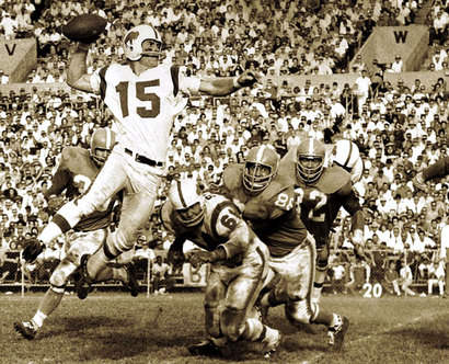
    I grew up with the 90's Bills the SB years and I still hate the Bills logo that the Bills have now on their helmets, and what is it about the streak that starts from where the eye of the Buffalo is supposed to be and goes through the middle of the buffalo's body and out of it's butt. The Sabres have the perfect logo with streaks above and below the buffalo that makes it like it's charging. Also if the can go back to the Joe Namath logo and what Kevin Arnold on the Wonder Years had on his jacket why can't the Bills go back to the red standing buffalo logo.

  21. #13
    Registered User Dr. Who's Avatar
    Join Date
    Jul 2002
    Location
    Atlanta
    Posts
    719
    Thanks
    1,500
    Thanked 509 Times in 279 Posts
    Power to Give Rep
    23

    Re: back to the red standing buffalo logo?

    I like the current uniforms a lot and I'd be perfectly fine with staying with them.
    I love the throwbacks better and I think the standing buffalo has more class, so that's my preference.

  22. #14
    Registered User Dr. Who's Avatar
    Join Date
    Jul 2002
    Location
    Atlanta
    Posts
    719
    Thanks
    1,500
    Thanked 509 Times in 279 Posts
    Power to Give Rep
    23

    Re: back to the red standing buffalo logo?

    Quote Originally Posted by Don't Panic View Post
    Gotta be the charging Buffalo. Standing Buffalo is nostalgic and classy, but ranks last in intimidation factor.
    Intimidation is all a function of the players wearing the uniform.

  23. Post thanked by:

    black N yellow (12-30-2014)

  24. #15
    Registered User BertSquirtgum's Avatar
    Join Date
    May 2009
    Location
    The North Woods
    Posts
    13,379
    Thanks
    4,689
    Thanked 3,399 Times in 2,198 Posts
    Power to Give Rep
    0

    Re: back to the red standing buffalo logo?

    No way. The rushing buffalo is so much better.

  25. #16
    that slimey ass of an admin at the zone Dude's Avatar
    Join Date
    Feb 2005
    Location
    Your world frightens and confuses me
    Posts
    18,176
    Thanks
    5,073
    Thanked 4,563 Times in 2,509 Posts
    Power to Give Rep
    139

    Re: back to the red standing buffalo logo?

    Get OJ out of the CA penal league while you're at it. Let's get the band back together!

  26. Post thanked by:

    DraftBoy (12-30-2014),Homegrown (12-30-2014),Night Train (12-30-2014)

  27. #17
    All-Pro Zoner Don't Panic's Avatar
    Join Date
    Dec 2005
    Location
    Raleigh, North Carolina, United States
    Posts
    4,227
    Thanks
    1,092
    Thanked 530 Times in 283 Posts
    Power to Give Rep
    28

    Re: back to the red standing buffalo logo?

    Quote Originally Posted by Dr. Who View Post
    Intimidation is all a function of the players wearing the uniform.
    True, but you might as well start with something that doesn't look like a statue at a museum.

  28. #18
    Registered User sukie's Avatar
    Join Date
    Sep 2012
    Posts
    21,500
    Thanks
    4,533
    Thanked 9,218 Times in 5,942 Posts
    Power to Give Rep
    64

    Re: back to the red standing buffalo logo?

    Quote Originally Posted by Don't Panic View Post
    True, but you might as well start with something that doesn't look like a statue at a museum.
    Like a stationary horseshoe or an evil earth shaking "G"? God... the fear a steel industry logo instills... Or is it the blank side that is intimidating?

  29. Post thanked by:

    black N yellow (12-30-2014),Dr. Who (12-30-2014),Joe Fo Sho (12-30-2014),Meathead (12-31-2014)

  30. #19
    Making Spirits Bright Joe Fo Sho's Avatar
    Join Date
    Mar 2006
    Posts
    6,194
    Thanks
    1,272
    Thanked 3,595 Times in 1,857 Posts
    Power to Give Rep
    34

    Re: back to the red standing buffalo logo?

    Quote Originally Posted by sukie View Post
    Like a stationary horseshoe or an evil earth shaking "G"? God... the fear a steel industry logo instills... Or is it the blank side that is intimidating?
    If you're not intimidated by a dolphin jumping out of the water in front of the sun, then you're made of stone.

  31. Post thanked by:

    Famous Amos (12-30-2014),IlluminatusUIUC (12-30-2014),Meathead (12-31-2014),Mr. Cynical (12-30-2014),sukie (12-30-2014),The last buffalo fan (12-30-2014)

  32. #20
    Registered User sukie's Avatar
    Join Date
    Sep 2012
    Posts
    21,500
    Thanks
    4,533
    Thanked 9,218 Times in 5,942 Posts
    Power to Give Rep
    64

    Re: back to the red standing buffalo logo?

    A helmet with the name of a collection of alcoholic smelly earth diggers with long beards and dishpan hands is intimidation.

    How about a logo that looks like John Kerry wearing a Paul Revere hat?

  33. Post thanked by:

    Famous Amos (12-30-2014)

Posting Permissions

  • You may not post new threads
  • You may not post replies
  • You may not post attachments
  • You may not edit your posts
  •